The Dos and Don’ts of Crafting a Lasting Impression
Today, we delve into a crucial aspect of branding—the creation of an impactful business logo. Your logo is often the first interaction a potential customer has with your brand, making it a pivotal element in shaping their perception of your business. In this blog post, we’ll guide you through the dos and don’ts of crafting a logo that leaves a lasting impression.
The Dos:
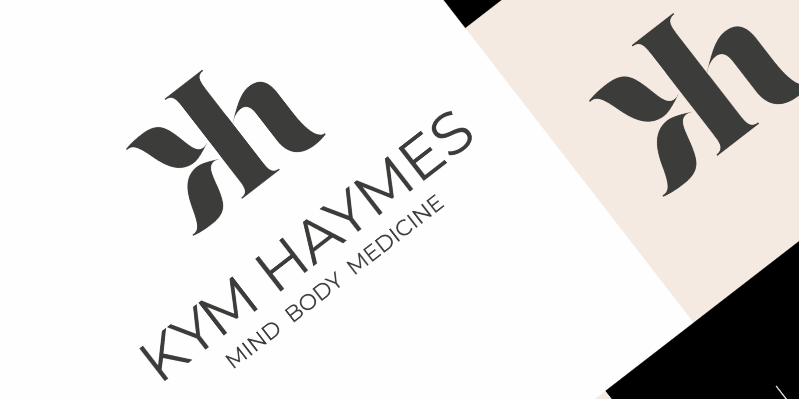
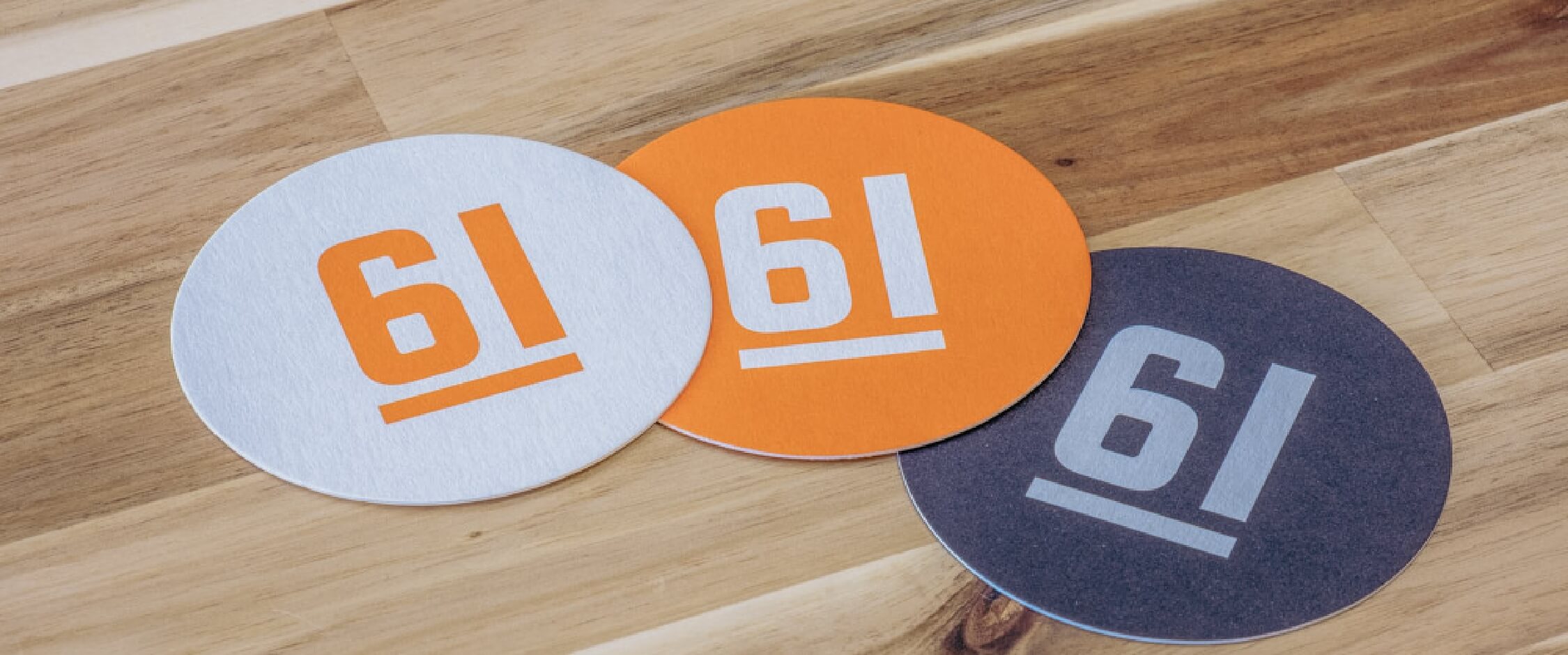
- Simplicity is Key: Your logo should be clean, simple, and easily recognisable. Think of iconic logos like Apple or Nike – memorable, yet straightforward. A clutter-free design ensures that your message is clear and easy to understand.
- Versatility Matters: A well-designed logo should work across various platforms and mediums. Ensure it looks just as good on a business card as it does on a billboard. This versatility ensures that your brand maintains a consistent image across all touchpoints.
- Reflect Your Brand Identity: Your logo should be a visual representation of your brand’s values and personality. Consider the emotions you want to evoke in your audience and tailor the design accordingly. Whether it’s professionalism, creativity, or friendliness, your logo should convey the essence of your business.
- Timelessness: Trends come and go, but a timeless logo will stand the test of time. While it’s tempting to follow the latest design fads, remember that your logo is a long-term investment. Aim for a design that remains relevant and appealing for years to come.
- Scalability: Whether it’s on a small business card or a large billboard, your logo should remain recognisable and maintain its integrity. Test your design at various sizes to ensure it remains effective and legible.
The Don’ts:
- Avoid Over-Complication: Too many details can clutter your logo and make it difficult to interpret. Remember, simplicity doesn’t mean lack of creativity; it means distilling your message down to its core elements.
- Steer Clear of Trends: While it’s essential to stay current, chasing design trends can result in a logo that quickly becomes outdated. Aim for a timeless design that transcends temporary fads.
- Say No to Clip Art: Your logo should be unique and tailored to your brand. Using clip art or generic templates may save time, but it won’t distinguish your business in a crowded market.
- Colour Chaos: While colour is a powerful tool in design, an overly colourful logo can be overwhelming. Stick to a simple colour palette that reflects your brand and is visually appealing.
- Font Fiascos: Avoid overly complex or trendy fonts. Opt for a font that aligns with your brand personality and is easy to read. Remember, legibility is paramount.
In conclusion, your logo is the face of your brand—a visual ambassador to the world. By adhering to these dos and don’ts, you’ll be on your way to creating a logo that not only captures attention but also leaves a lasting, positive impression on your audience.
If you’re looking for professional assistance in crafting a unique and effective logo, our team at 61 Design is here to bring your vision to life. Contact us today to embark on a logo design journey that sets your business apart from the rest.